Cramer Group Brand Refresh
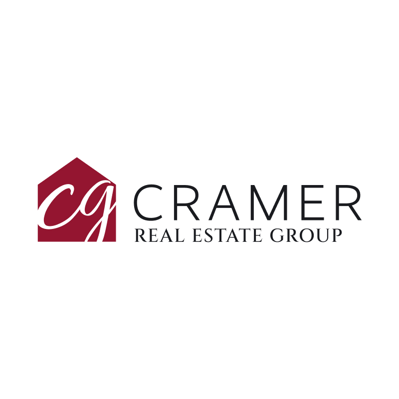
Prominent Las Vegas real estate company The Cramer Group approached me with an initiative to update their aging brand identity.


Cramer Group Brand Refresh
Prominent Las Vegas real estate company The Cramer Group approached me with an initiative to update their aging brand identity.
Evolution vs. Revolution
The client’s stated goal was to evolve the existing brand identity rather than completely replacing it: “more of an evolution than a revolution”.
Additionally, the client expressed a desire to create a “premium brand” that felt “modern and somewhat niche”.
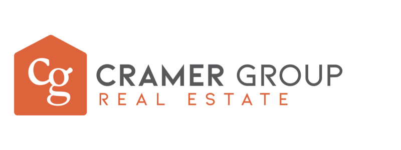

Brand Inspiration
The client provided an eclectic list of “premium” brands he had an affinity for


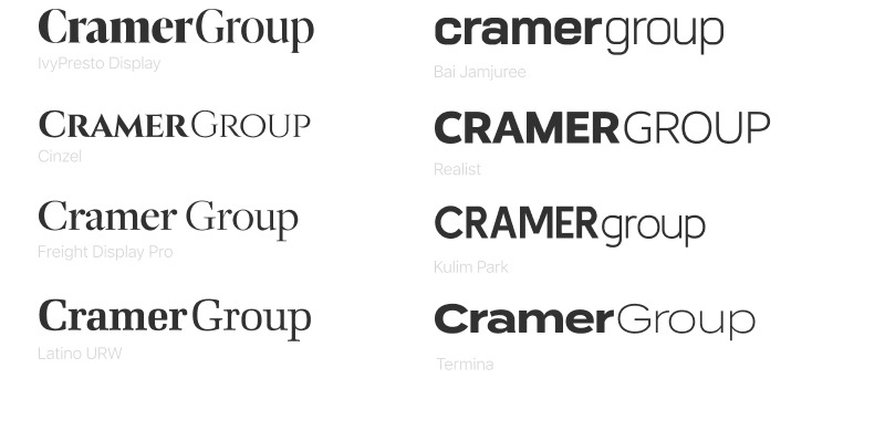
Typography
Taking the brand inspiration into account, I presented a handful of typography options including variations on capitalization and font weight

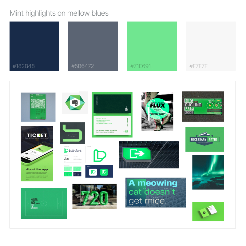
Color palette
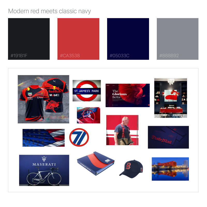
After numerous broad color palette explorations, the client selected his 2 favorites.
“Mint highlights on mellow blues” centered around a pleasing mint green and understated blue tones.
“Modern red meets classic navy” stayed closer to the brand’s existing palette while adding some richness and depth.


Let’s Work Together
Tell me more about your project
Lorem ipsum dolor sit amet, consectetur adipiscing elit, sed do eiusmod tempor incididunt ut labore et dolore magna aliqua. Ut enim ad minim veniam, quis nostrud exercitation ullamco laboris nisi ut aliquip ex ea commodo consequat. Duis aute irure dolor in reprehenderit in voluptate velit esse cillum dolore eu fugiat nulla pariatur.


